
We engineer custom analytics UIs, data visualisation platforms, and multi-tenant reporting dashboards — built for SaaS companies where analytics is a product differentiator, not an afterthought.
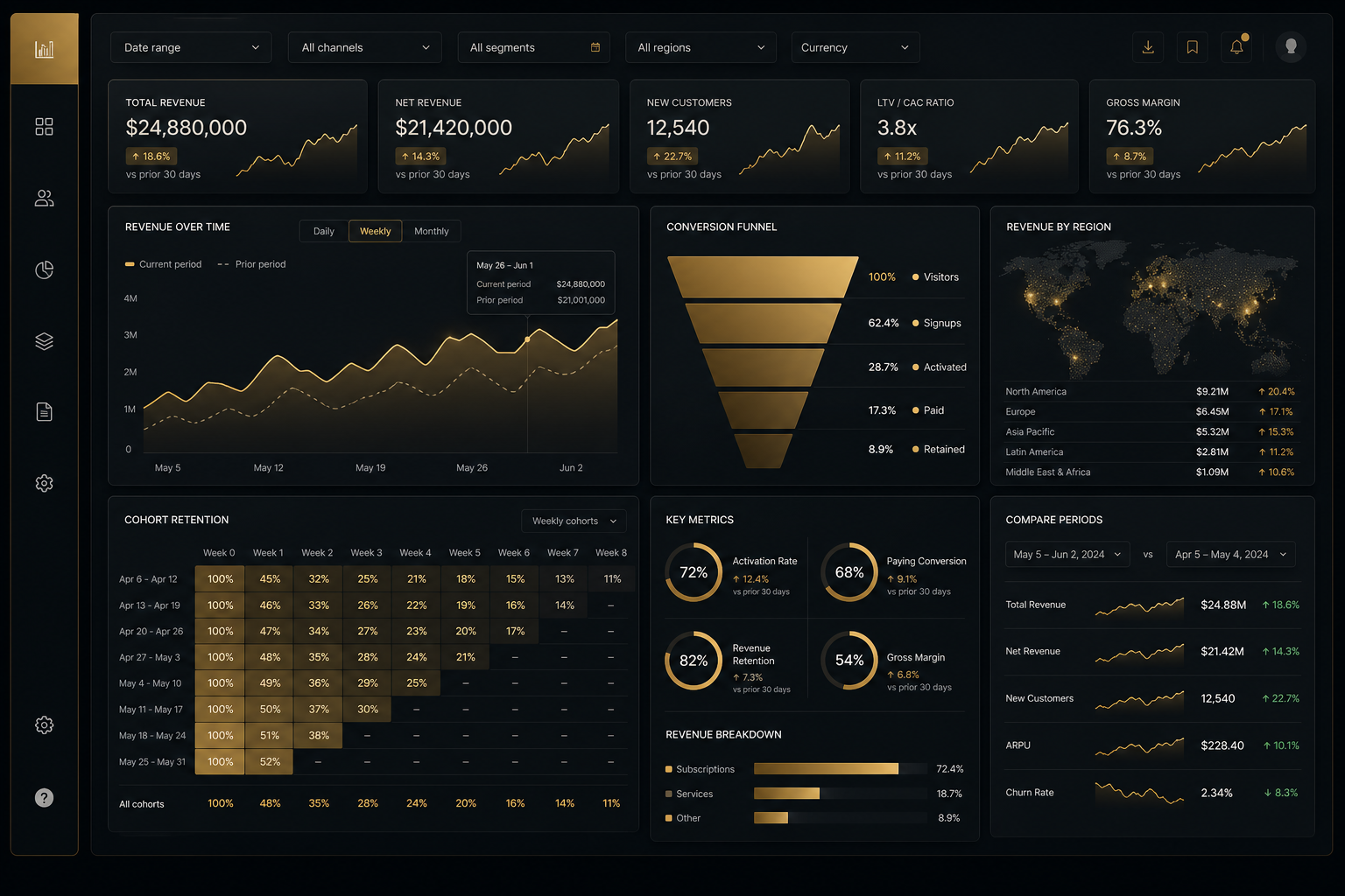
In the evaluation meeting where a buyer is deciding between your SaaS product and a competitor, the analytics section of the product demonstration often makes the decision. Buyers do not just want software that does things — they want software that tells them whether those things are working. A product with a rich, clear analytics dashboard answers that question every time a user logs in. A product with a sparse analytics section leaves users exporting data to Excel, building their own dashboards in Notion, and eventually asking whether the product itself understands their business well enough to serve it.
The users who export data to Excel are your highest-engagement power users — the people who care most about getting value from your product. Their decision to go outside the application to analyse their data is a direct signal that the analytics capability is not meeting their needs. It is also a churn signal: users who have built their own analysis workflows outside your product are one decision away from deciding the product is just a data entry mechanism for their actual work tool. Investing in analytics UI is not just feature work — it is retention engineering.
Analytics is also harder to build well than it appears. The technical challenges are real: multi-tenant data isolation, complex date range and comparison period logic, drill-down navigation with consistent filter state, large dataset rendering without DOM overflow, chart type selection that accurately represents the data's structure, and export functionality that produces clean output users can actually use. A product that gets all of these right, consistently, across a range of data types and user sophistication levels, has built a genuinely difficult competitive moat. A product that gets them half-right has built a source of ongoing user complaints and product manager escalations.
We build analytics dashboards as product features, not as added-on reporting screens. Every decision — what data to show, how to show it, what interactions to support, what to export — is made with the question "does this help the user make a decision?" at the centre.
Choosing the wrong chart type for a dataset is one of the most common and most costly mistakes in analytics UI. A bar chart that should be a scatter plot obscures the correlations users need to see. A line chart that should be a grouped bar chart creates a false impression of continuity in categorical data. A pie chart with 14 segments is functionally unreadable regardless of how well it is styled. These are not aesthetic mistakes — they are functional failures that prevent users from extracting the insight the data contains.
We approach chart selection as a UX decision informed by data visualisation research. Tufte's principles on data-ink ratio guide our approach to chart decoration — every non-data ink element (gridlines, borders, labels) is evaluated for whether it adds informational value or merely visual complexity. Cleveland and McGill's hierarchy of visual encodings informs channel selection: when comparing magnitudes across categories, position on a common scale (bar chart) is more accurately decoded by humans than area (bubble chart) or colour intensity (heatmap). Pre-attentive attributes — the visual properties that are processed before conscious attention — guide our use of colour, size, and motion in alert and anomaly highlighting. Every major chart type decision is documented with the reasoning that justifies it, so product teams can understand and discuss the choices rather than accepting them as black-box recommendations.
D3.js provides complete programmatic control over SVG and Canvas rendering, making it the right choice when standard chart library components cannot express the data relationship the product needs to communicate. D3's data join pattern — binding data arrays to DOM elements with enter, update, and exit selections — enables smooth animated transitions when data changes, which is particularly valuable for time-series comparisons and drill-down navigation where users benefit from visual continuity between states.
We build D3.js visualisations as Angular wrapper components, encapsulating the D3 lifecycle within Angular's component architecture. The component receives data as typed inputs, manages its own D3 rendering in response to Angular lifecycle hooks, and emits interaction events (hover, click, brush selection) as Angular outputs. This pattern makes D3 visualisations composable within Angular templates and testable within Angular's testing framework, while preserving D3's full rendering capability. For very high data point counts — scatter plots with 50,000+ points, time-series with minute-level granularity over multiple years — we implement Canvas fallback rendering, which avoids SVG's DOM element-per-data-point limitation and maintains interactive performance through quadtree-based spatial indexing for hover detection.
The decision of when to use D3 versus a standard chart library like Chart.js or ECharts depends on the requirements. Standard libraries are appropriate when the chart types they provide match your data requirements, when the styling customisation they allow is sufficient for your product's visual identity, and when development speed is prioritised over rendering flexibility. D3 is appropriate when you need a chart type that no standard library provides, when you need complete control over animation timing and interpolation, when you need custom interaction behaviours (brush selection, linked highlighting across multiple charts, zoom), or when performance requirements at very high data volumes exceed what SVG-based libraries can deliver.
Analytics dashboards in SaaS products must enforce strict data isolation between tenants. A customer's analytics must only ever contain that customer's data — cross-tenant data leakage is a catastrophic trust failure. We implement tenant scoping at every layer of the analytics data pipeline: API requests include tenant context in the authentication token (not as a user-controlled parameter that can be manipulated), NgRx store slices are keyed by tenant ID so data from different tenant sessions cannot intermingle, and UI state (selected date ranges, active filters, custom dashboard layouts) is persisted per tenant rather than globally.
Enterprise customers on higher product tiers often expect configurable dashboard layouts — the ability to arrange which analytics panels appear and in what order, create custom KPI views from a library of available metrics, and share dashboard configurations with their team. We implement this as a dashboard configuration system: layout configurations are serialised as JSON and stored per user per tenant, loaded at session start, and modified through a drag-and-drop layout editor that allows panels to be added, removed, and resized. Product tier gating controls which analytics panels are available to each customer's configuration.
Date range selection is the primary navigation mechanism in analytics dashboards, and it deserves more engineering investment than a simple date picker. We build custom date range components that support standard presets (last 7 days, last 30 days, last quarter, year to date, custom range), comparison period selection (compare to previous period, compare to same period last year), and fiscal calendar alignment for customers whose reporting periods do not match calendar months. The selected date range and comparison period are persisted in the URL as query parameters, enabling users to share specific views and reload them consistently.
Drill-down navigation — clicking a data point in a high-level chart to navigate to a more granular view — is an interaction that requires careful engineering to feel smooth and coherent. We implement drill-down as a state machine with explicit breadcrumb navigation: each drill-down level is a URL state, so back navigation works correctly and deep views can be bookmarked and shared. Filter state accumulates as users drill down, so the data at each level is correctly scoped to the selections made at higher levels. Animated transitions between drill-down levels provide visual continuity that helps users maintain spatial understanding of the data hierarchy.
Export capability transforms analytics from a view-only tool to a working tool. Users who can export the specific slice of data they are looking at — with the same date range, filters, and columns they see in the UI — spend less time cleaning and reformatting data in their own tools. We implement CSV export as a server-side operation to avoid transmitting the entire dataset to the browser before downloading it. Excel export preserves column types (numbers as numbers, not as text) and optionally includes embedded charts generated server-side. PDF export with configurable chart inclusion enables shareable reports for stakeholders who do not access the analytics dashboard directly.
Scheduled report delivery — automatically generating and emailing report PDFs on a configured schedule — is a feature that significantly increases analytics engagement for stakeholders who do not check the dashboard regularly. We build scheduled delivery as a configurable workflow within the analytics settings, with preview before scheduling, flexible frequency options, and per-recipient personalisation for white-label multi-tenant contexts.
Tell us your data types, user roles, and key metrics. We'll outline what analytics capabilities would have the most impact on your product's retention and differentiation.
Start the ConversationRelated Services
SVG and Canvas-rendered custom charts for complex data relationships, animated transitions, brush selection, and linked highlighting — built as reusable Angular components.
Draggable KPI card systems with sparkline trends, comparison period deltas, threshold-based status colours, and per-user layout persistence with product tier gating.
Tenant-scoped data fetching, NgRx store tenant isolation, configurable dashboard layouts by product tier, and white-label report output for enterprise customers.
Custom date range pickers with fiscal calendar support, comparison period overlays, and URL-persisted filter state for shareable, bookmarkable analytics views.
State-machine drill-down with breadcrumb navigation, URL-persisted drill state, animated level transitions, and accumulating filter context across drill levels.
Server-side CSV and Excel export, PDF report generation with charts, scheduled email delivery, and white-label report output for multi-tenant enterprise customers.
Standard chart libraries like Chart.js and ECharts are the right starting point for the majority of analytics requirements. They offer a comprehensive range of chart types, reasonable styling customisation, and significantly faster development time than building equivalent charts from scratch in D3. We use them for bar charts, line charts, area charts, pie/donut charts, and most standard KPI visualisations. D3.js becomes the right choice when: you need a chart type that standard libraries do not provide (chord diagrams, sankey diagrams, custom network graphs, geographic visualisations beyond basic markers); you need custom interaction behaviours that standard libraries cannot accommodate (brush selection that links multiple charts, zoom with custom scale ranges, hover effects that cross component boundaries); you need animated transitions with full control over interpolation and timing; or you need Canvas rendering for performance at very high data point counts that SVG cannot handle. In practice, most analytics dashboards use a combination: standard library charts for common chart types and D3 for the one or two custom visualisations that make the product distinctive.
Data freshness is a UX concern as much as a technical one. Every analytics view displays a "data as of" timestamp showing when the displayed data was last refreshed, so users always know whether they are looking at data from this hour or this morning. For near-real-time analytics, we implement WebSocket or SSE subscriptions that push updates to the UI as new data arrives, with the last-updated timestamp updating visibly. For batch-computed analytics (daily aggregates, weekly roll-ups), we display the schedule for when data is refreshed and alert users if data is significantly delayed. Manual refresh controls are always available so users can trigger a fresh data fetch without waiting for the next automatic cycle. We never silently show potentially stale data without indicating its age.
Yes, and this is an area where intentional design makes a significant difference. Charts present specific accessibility challenges — a line chart is meaningless to a screen reader user unless we provide an accessible text alternative. We implement ARIA descriptions for every chart type that summarise the key insight the chart conveys, provide data table alternatives to visual charts that screen reader users can access, and ensure keyboard navigation for interactive chart elements (data point focus, filter controls, drill-down actions). Colour is never the sole encoding for categorical information — we pair it with pattern fills, labels, or shape variation. All interactive controls meet WCAG 2.2 AA contrast and target size requirements. For enterprise customers with documented accessibility requirements or VPAT needs, we conduct specific testing with NVDA and VoiceOver and produce remediation documentation.
Large datasets require a different strategy at each layer. At the data layer, server-side aggregation is the primary tool — instead of transmitting 10 million individual event records to the browser and rendering them, the API returns pre-aggregated metrics (daily totals, hourly counts, percentile distributions) that are appropriately sized for visual encoding. For time-series with very fine granularity over long periods, we implement adaptive resolution: at the "last year" zoom level, data is aggregated to daily points; at the "last week" level, to hourly points; at the "last day" level, to minute points. At the rendering layer, Canvas outperforms SVG for scatter plots beyond approximately 1,000 points — we use Canvas with quadtree-based spatial indexing to maintain hover detection performance at very high point counts. For tabular data views within analytics, CDK Virtual Scrolling ensures that DOM element count remains constant regardless of result set size.
Describe your analytics requirements and we'll respond with a direct technical proposal.